Football Club Project
From research to implementation
1/ Competitive Research

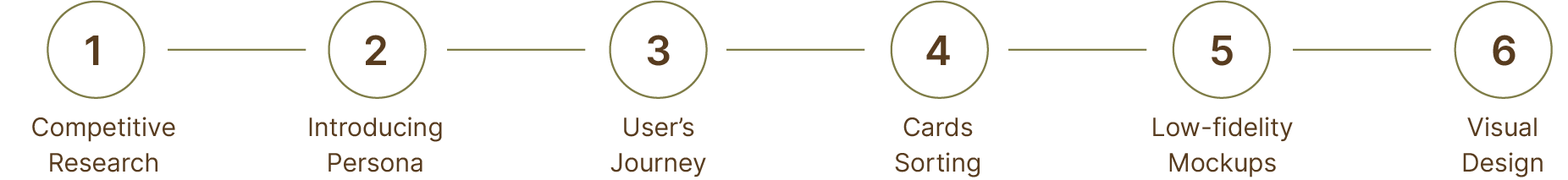
UX design process
For this project I've decided on the following stages.
3/ User's Journey
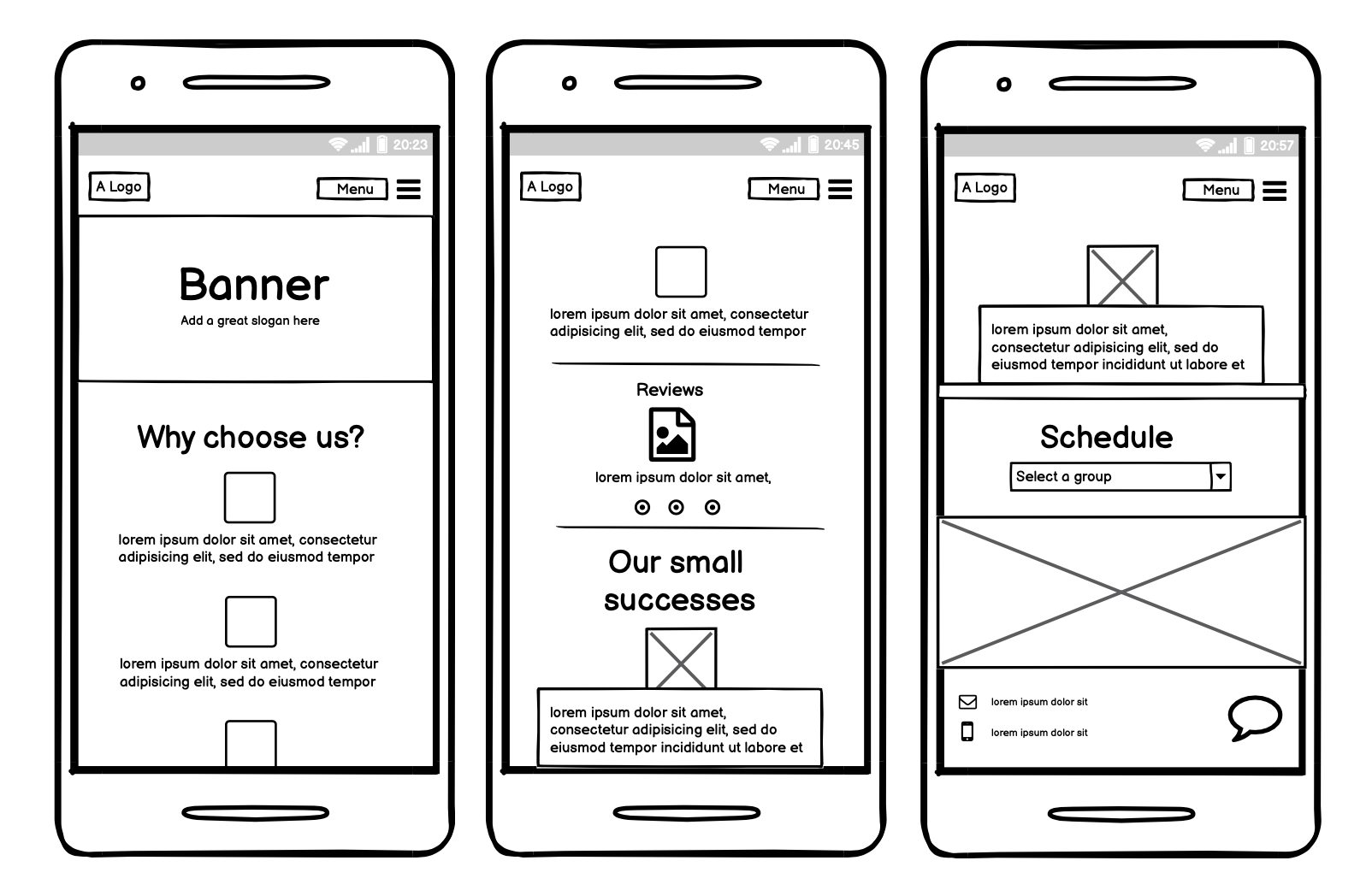
5/ Low-fidelity Mockups
Iterations
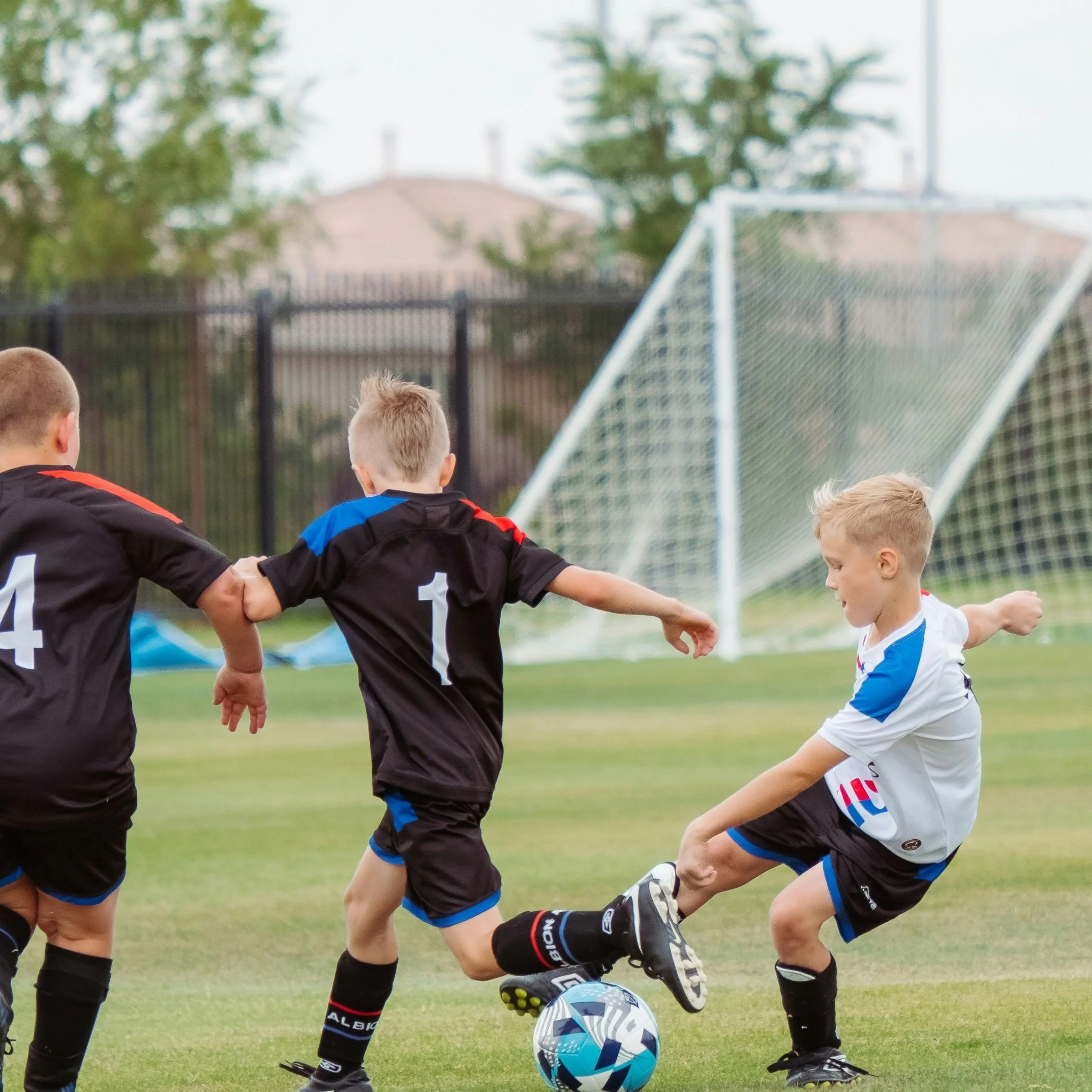
The children football club owners wanted to increase the number of children attending their club.
Bring more parents and children to the club
Appeal to families with children (mostly boys)
Increase traffic on mobile site and social media
At the discovery phase of my project, I made an extensive research of competitors, concentrating mostly on children sports clubs (mobile versions).
Aspects I considered:
How easy is mobile site's navigation.
How content is organized.
What categories it contains/lacks.
What are sites' missions.
Weaknesses/strenghts of the competitors.
How updated information is on the sites.
What I found out:
There was no convenient site navigation on many sites.
Schedules of trainings and activities were not updated.
I was missing latest photo and video reports from training and different outdoor activities.
There was too much content and it was not organized a convenient way.
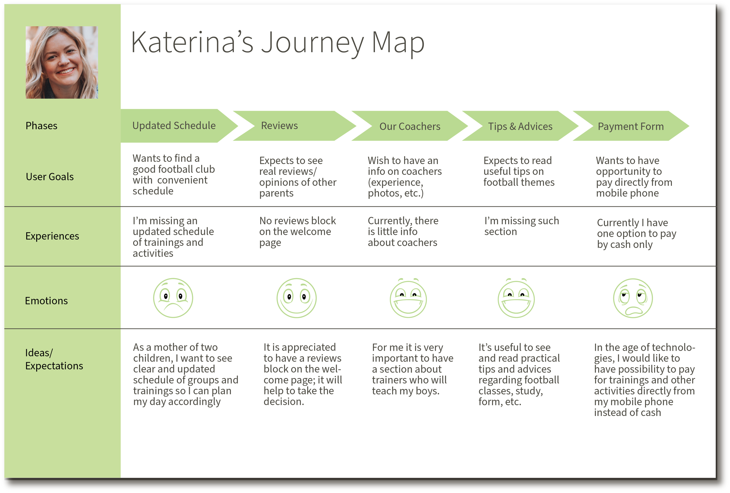
Once the competitive research was done, I've started to create a persona.
2/ Competitive Research
Based on the competitive research and interviews with owners, I've set up a persona to which I referred to throughout the entire design process.
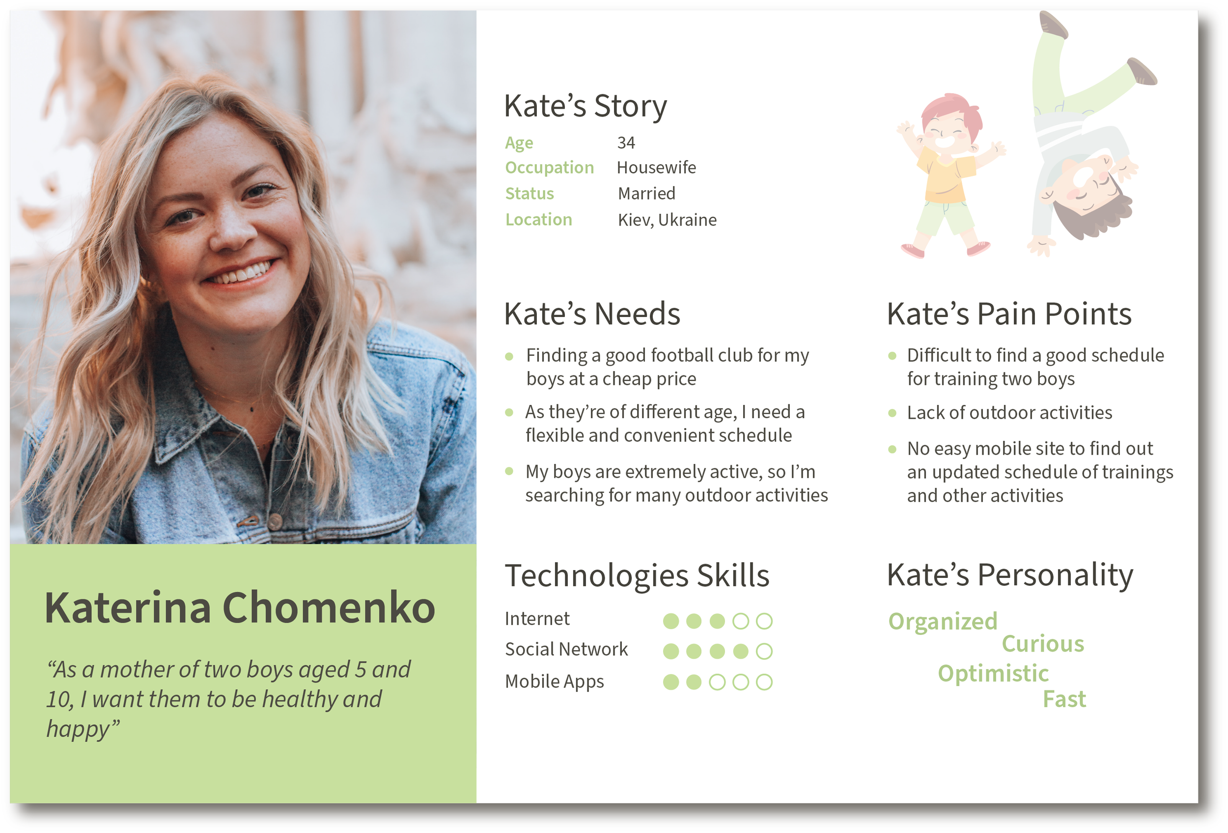
I decided to have one persona for this project - a mom. A mother spends more time with her children and will make the decision. Plus, she is sociable and communicative and therefore is mostly concerned about finding the right sport club.
To develop the right persona, I conducted an interview with the director of the club and a few interviews with boys' mothers.
Using data from competitive research, personas, interviews, I outlines the main user goals as well as frustrations/problems they might have on regular mobile site of sports clubs.
The resulting map is to the right.
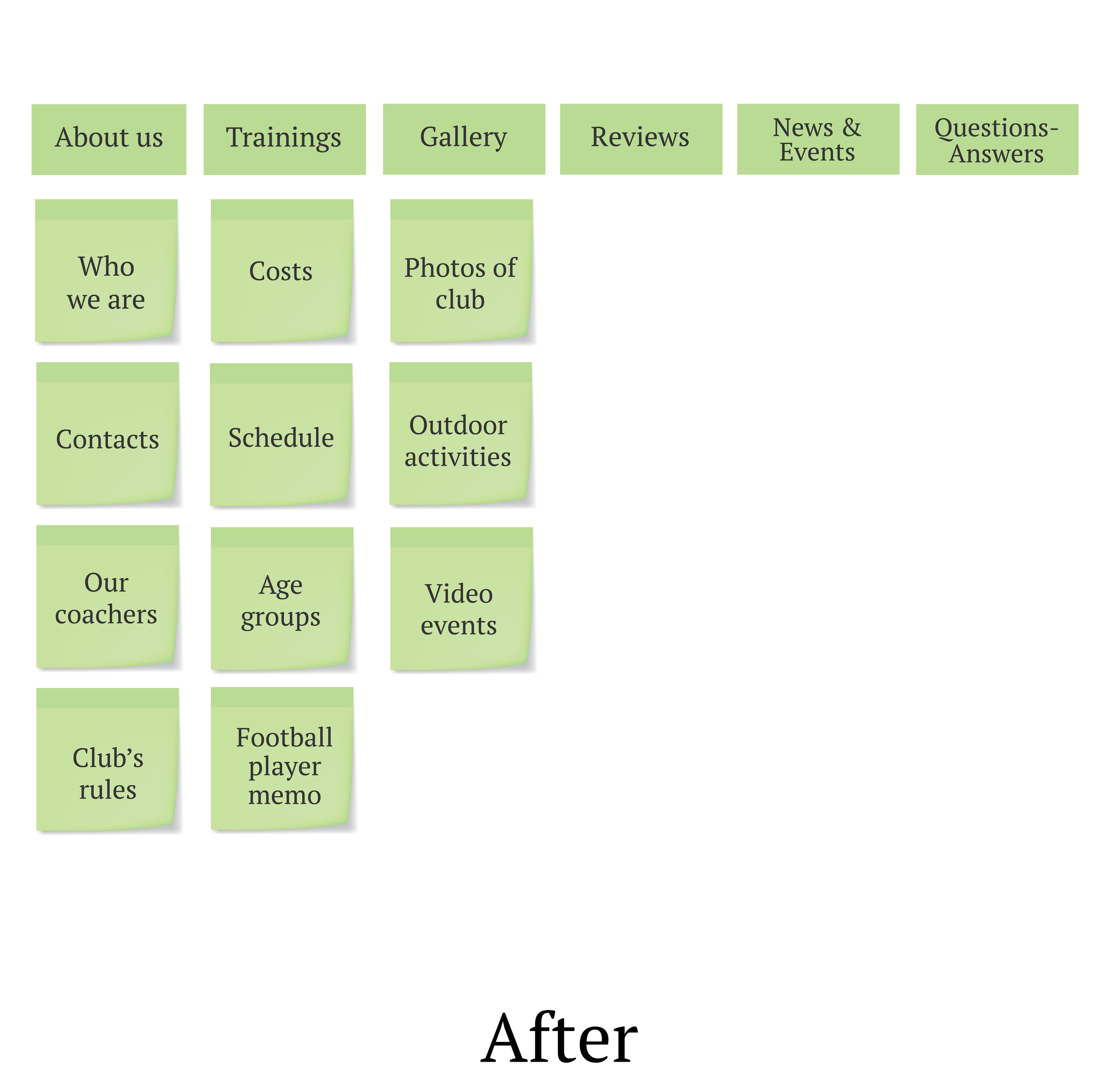
4/ Cards Sorting
As this was the mobile site from scratch, I decided that card sorting will be very important. I used Open Card Sorting both online and offline.
See the image to the left.
When atoms, molecules, and organisms were designed, I've started to work on the next atomic design component - templates.
I created the mockups in Balsamiq tool as I find it very convenient and flexible for designing low-fidelity prototypes.
When the first mockups were done, I've tested them with users and owners, made some iterations before moving to the Pages creation.
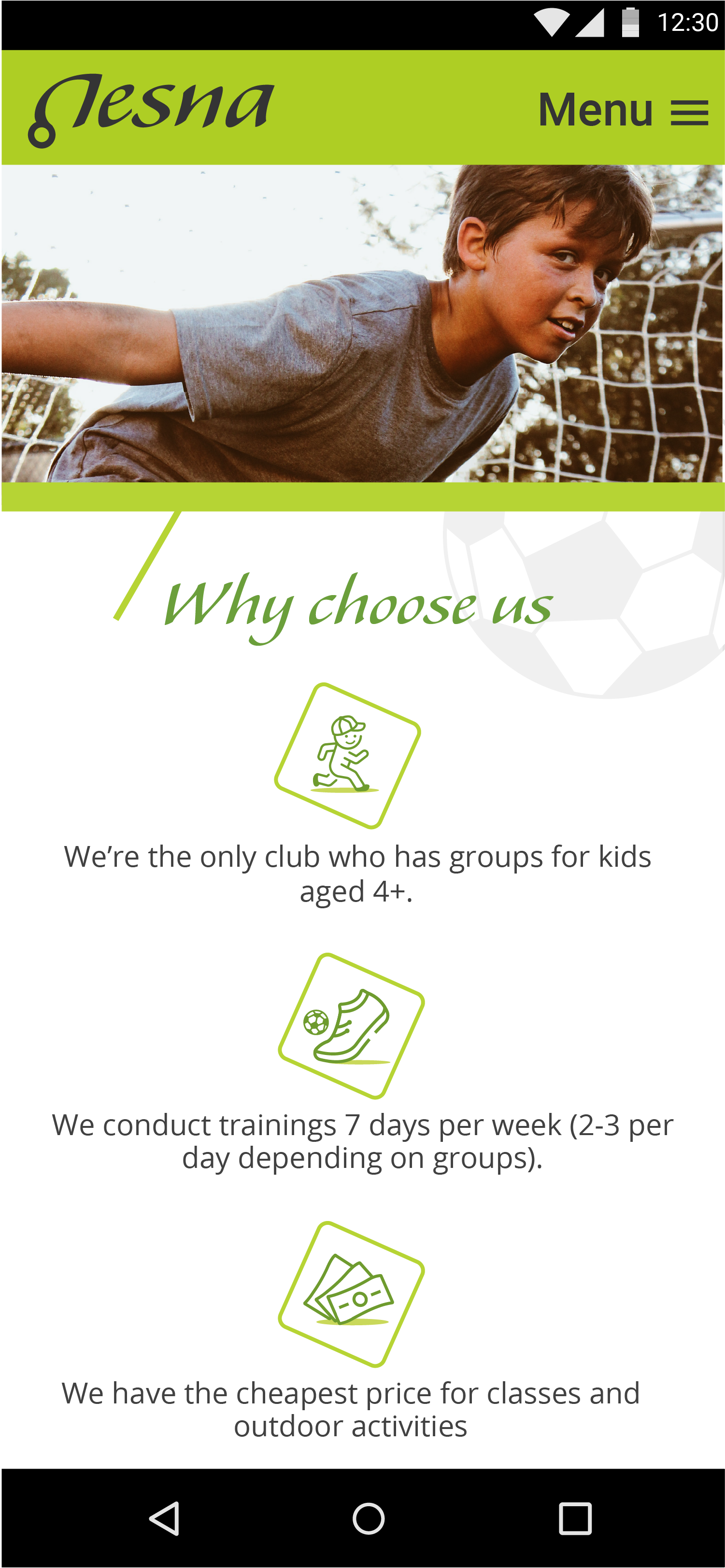
See example to the left for a mockup of a welcome page.
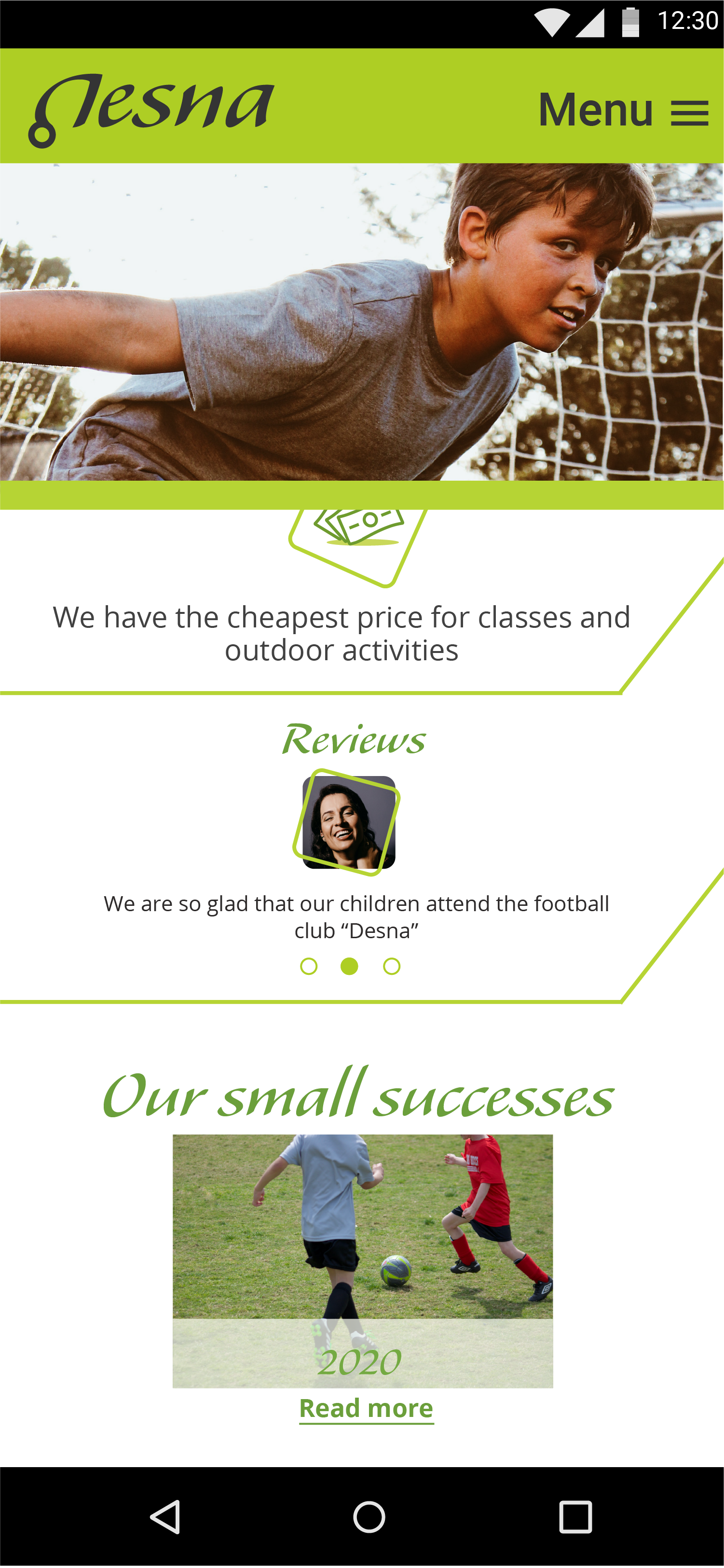
5/ Visual Design
Once the low-fidelity mockups were approved with the owners, I started to work on the brand colors and visual representation.
I created two tones of green color for the main corporate brand. I decided that green is a synthesis of nature and sport and is associated with healthy style of life. Besides, my green colors are bright and warm which represent energy and children. Also, this color is very optimistic and well balanced.
For the text to be more contrasting I've chosen a darker green, while for some additional site elements the lighter and brighter color is used.
9
Take-aways
30
Screens
Business Requirements
Business Goals
6
Interviews
5
Scenarios