Football Club Project
From research to implementation
Business Requirements
Attract more young players to join the children football club.
Business Objectives
Boost engagement and visitor activity on the website and social media platforms.
Strengthen parental involvement.
Increase fan engagement.
Project Goals
Design a modern website for the children football club.
The Process
Ideate
Prototype
Test
Empathize
Define
1/3 Ethnographic Research
1/1 Interviews with Stakeholders and Users
a) 1-on-1 interview with parents
1/ Empathize
Overview
Interviews with Stakeholders and Users
Competitive Analysis
Ethnographic Research
My task was to create a children's football club website. Therefore, I chose to apply four research methods to gain a comprehensive understanding of how the site should serve its users. These methods were carefully selected to explore how different user groups—parents, coaches, and young players—interact with similar platforms. By examining navigation patterns, accessibility, and usability, I aimed to uncover common pain points and areas for improvement. This research also evaluated how effectively essential information—like training schedules, match updates, registration processes, and club news—is delivered. The ultimate goal was to ensure the final website would be intuitive, engaging, and accessible for all key users.
I conducted 1-on-1 interviews with parents, focus groups with young players, and discussions with coaches. Gathering insights from these key stakeholders provided a well-rounded view of usability and helped shape a more effective, user-centered website experience.
Conducting a Competitive analysis was essential for designing a user-friendly, engaging, and functional children's football club website. It provided me with valuable insights into what works well, what needs improvements, and how to create a platform that effectively serves parents, young players, and coaches. By leveraging these insights, I was able to develop a set of recommendations aimed at enhancing usability, engagement, and overall digital experience.
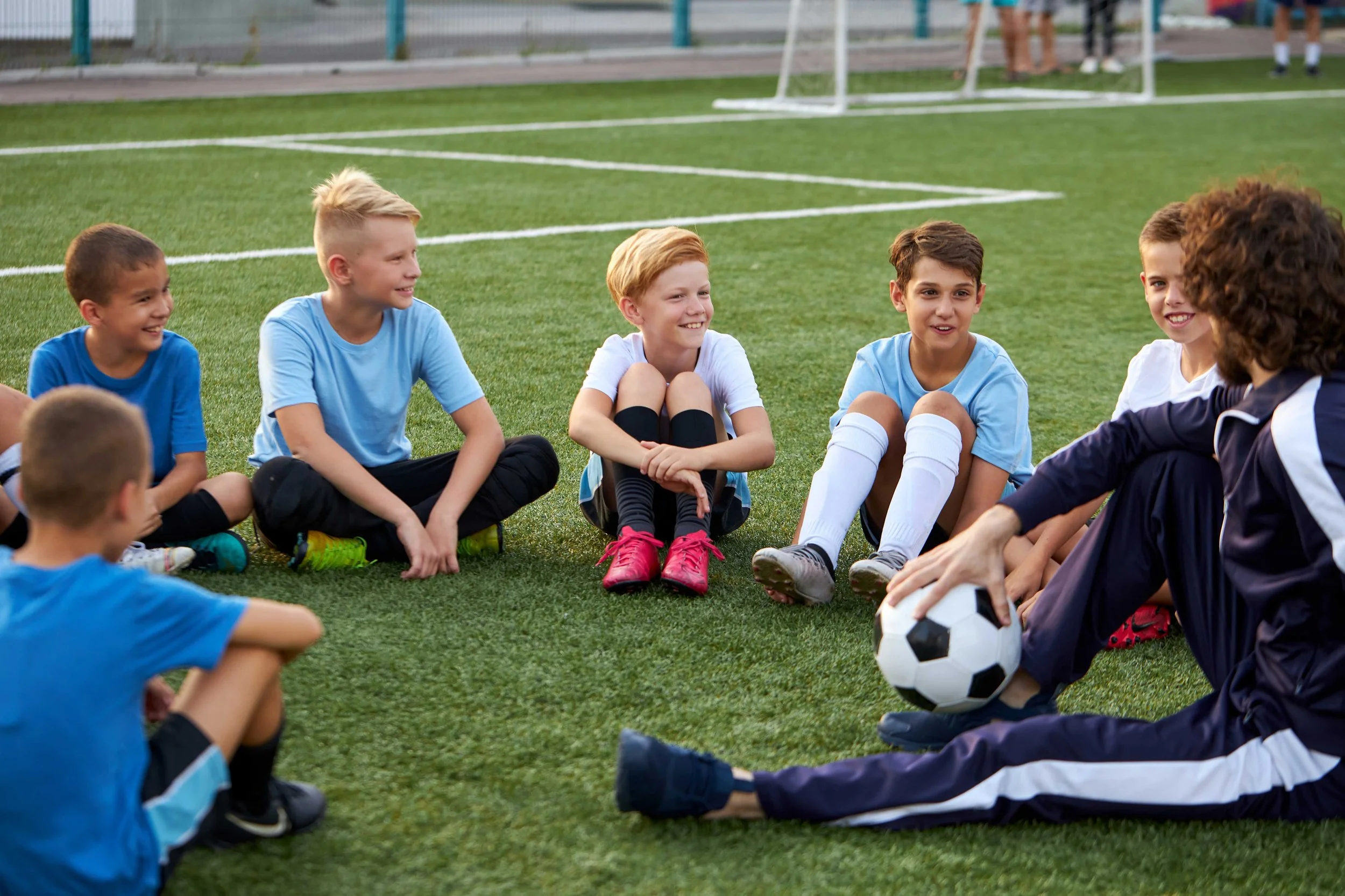
I chose Ethnographic research to observe real interactions between children and coaches within the football club. Unlike surveys or interviews, this method offered a deeper, firsthand understanding of how children engage with club activities, digital platforms, and communication in their natural environment.
Surveys and polls were essential for reaching a broader audience and collecting targeted feedback on key features. The insights gathered helped improve communication, engagement, and guided the design of a more user-friendly and effective digital experience.
For the interviews, I selected a diverse group of 10 parents with varying experiences, including
New members (who recently joined the club)
Experienced members (who have been with the club for a long time)
Parents of different age groups (kids 5-7, 8-12, 13-16)
Some of the questions for interviews were:
"How did you first learn about the club, and what made you sign up your child?"
"What do you like most about the club? What could be improved?"
"Have you faced any challenges with scheduling, attendance, or reminders?"
"How do you receive updates from the club? (WhatsApp, email, website, etc.)"
"What information do you wish was more easily accessible?"
"How often do you communicate with coaches? What do you usually discuss?"
"Does your child feel motivated to improve their skills? What motivates them?"
"Would you be interested in features, like training videos, AI-based feedback, or gamified challenges?"
b) Focus groups with young players
c) Discussions with coaches
Although discussions with coaches were a lower priority, they remain an important user group. Coaches play a key role in communicating with players and parents, and their feedback helps ensure the website effectively supports training, scheduling, and team coordination.
Questions for coaches
“How long have you been coaching kids/teens?”
“What motivates your players the most during training or matches?”
“Do you currently use any digital tools or websites for your coaching tasks (schedules, communication, tracking progress)?”
“How do you usually communicate match times, training changes, or events to players and parents?”
“Would it be helpful to have a coach-only section on the website? What would you want to see there?”
“How do you track your players’ progress or attendance?”
“Would you like to upload team photos, match results, or shout-outs for players?”
“How could the website help make your job easier or more fun?”
This type of interview was the most challenging, as it involved children of different age groups—including some as young as 5–6 years old. To ensure age-appropriate communication, I divided them into three focus groups and conducted the sessions separately for:
Young children (5-8 years)
Pre-teens (9-12)
Teens (13-16)
Each group contained 6-7 participants to keep discussions interactive, but manageable.
Before conducting the interviews I defined the main Goals & Objectives, namely:
Understand what excites children about the football.
Identify pain points in training, matches, and communication.
Explore their technology habits and expectations from a football club website.
I have also prepared a Discussion Guide, which I adapted to each age group.
For young children I created fun and interactive questions and tasks. Some questions for young children:
"What’s your name and how old are you?”
“Who is your favourite football player?"
"What do you love most about playing football?"
And some tasks for them:
Show some of the colors and ask participants to select the most favourite color. What do they associate this color with?
Distribute emoji cards between the children (Happy, Frustrated, Excited, Bored) and read out different football-related scenarios to them (i.e. When I miss training, When I lose a match, etc.), ask them hold up the emoji that matches how they feel.
Give children stickers or cutout images of different football attributes (e.g., Speed, Passing, Dribbling, Defending, etc) and let them build their “ultimate” player by choosing the skills they think are most important.
For pre-teens and teens groups the questions were more complicated and engaging:
“If your favorite football club’s website were a person, what kind of person would it be? (Cool? Funny? Serious?)”
“If the site had a secret area just for fans your age, what should be in it?”
“What’s the coolest website or app you’ve ever used? What made it cool?”
“Do you prefer big pictures and videos, or do you like to read stories and news?”
“How do you usually hear about football news—friends, YouTube, social media, or websites?”
“Would you use a football site more if it had games, quizzes, or prizes?”
“Do you follow any football players or clubs on social media? What kind of posts do you like?”
“What’s the coolest thing you’ve seen online lately?”
Click the image to enlarge it
1/2 Competitive Analysis
Before conducting a Competitive Analysis, I identified the following key factors that require my attention during the process, namely:
Analyze the website design of other football clubs - how easy is it for parents and children to navigate?
Look for mobile responsiveness (since many users will access the site from smartphones).
Check if the design is child-friendly (e.g., colorful, engaging for kids, simple interfaces).
How well is information categorized? Is it easy to find essential details, such as schedules, registration forms, or information about ?
Review how easy it is for parents to register their children. Is the process streamlined and user-friendly?
Check how clubs provide match schedules, changes, and results. Do they offer email or SMS notifications to parents?
See how clubs showcase players—do they share team photos or match videos? Is this content accessible to parents and kids?
Does the club offer resources like training tips, fitness advice, or skills development videos? Is this content tailored to children and teenagers?
Does the club have a blog or articles offering advice on youth sports, parenting in sports, or children’s mental health in football?
Does the club showcase testimonials from parents or players? Are there success stories or positive experiences highlighted on their website or social media?
Identify what makes each football club stand out. Does it offer something unique for children, such as specialized coaching, flexible schedules, or a focus on mental well-being?
Are the football clubs catering to younger children, teens, or both? How do they tailor their offerings (training, website design, communications) to different age groups?
I have selected five companies for my competitive analysis.
To better understand the real-world interactions between children and coaches in a football club environment, ethnographic research was conducted through multiple direct observations of training sessions, matches, and informal moments at the club over several weeks. The research focused on children aged 5 to 12 and the coaching staff, capturing authentic behaviors and communication patterns.
Here are the key observations for the Research.
Click the image to enlarge it

Following the initial research phase, I moved into the analysis stage to make sense of the data and uncover actionable insights. I decided to use the following methods: Research Data Synthesis, User Personas, User Journey Maps, and a Key Insights Report. These tools helped me identify recurring patterns, user needs, and pain points across different groups—children, parents, and coaches. The findings from this stage laid the foundation for a user-centered design approach in the next phase.
To make sense of the qualitative data gathered through interviews, focus groups, observations, and surveys, I conducted an affinity mapping exercise. This method allowed me to identify recurring themes, patterns, and user needs by clustering similar insights across all participant groups. The resulting categories helped guide the definition of core features and informed key design decisions for the children's football club website.
Click the image to enlarge it
2/ Define
Overview
Affinity Mapping
User Personas
User Journey Maps
Key Takeaways
2/1 Affinity Mapping
2/2 User Personas
Click the image to enlarge it
To guide the design of the football club website, I developed three user personas based on insights from interviews, surveys, and observations. These personas represent the key user groups—parents, young players, and coaches—and helped ensure the platform meets their specific needs and expectations.
Click the image to enlarge it

Click the image to enlarge it
2/3 User Journey Map
To better understand the needs, behaviors, and experiences of the different users involved in the children’s football club, three user journey maps were created—one for each persona. These maps visualize the steps each user takes, their goals, thoughts, and emotions at every stage, as well as potential pain points and opportunities for improvement.
Click the image to enlarge it
To deeply understand the needs, preferences, and challenges of the children’s football club community, I conducted a series of 1-on-1 interviews and focus groups. Engaging with parents, young players, and coaches allowed me to identify shared pain points, uncover opportunities for improvement, and gather ideas for features that could meaningfully enhance their experience. The following key takeaways summarize the most valuable insights from these research sessions.
2/4 Key takeaways
Focus groups with young players
Click the image to enlarge it
Click the image to enlarge it
Focus groups with coaches
Click the image to enlarge it
1-on-1 interview with parents
Click the image to enlarge it
Click the image to enlarge it

It was now time to create low-fidelity mockups and get approval from stakeholders.
3/1 Filtering Mockups
Click the image to enlarge it
3/ Mockups
Overview
Filtering Mockups
Navigation Mockups
Dashboard Mockups
Context Mockups
The first thing I did was divide the "Company" and "Filters" into two separate tabs for convenience. In the first step, the user selects the company or companies, then moves on to the filter selection.
For company selection, I also introduced a search function so that users could find a company instantly. Additionally, I replaced the black highlights with checkboxes. I also added categories and subcategories to the filters, which were then reflected in the chips.
3/2 Navigation Mockups
For the navigation pane, I introduced two views: expanded (default) and collapsed. The expanded view is useful for new users who are still learning the platform and its modules. The collapsed view is preferable for users who are working with large amounts of data and need more space on the main screen for graphs or dashboards.
Click the image to enlarge it
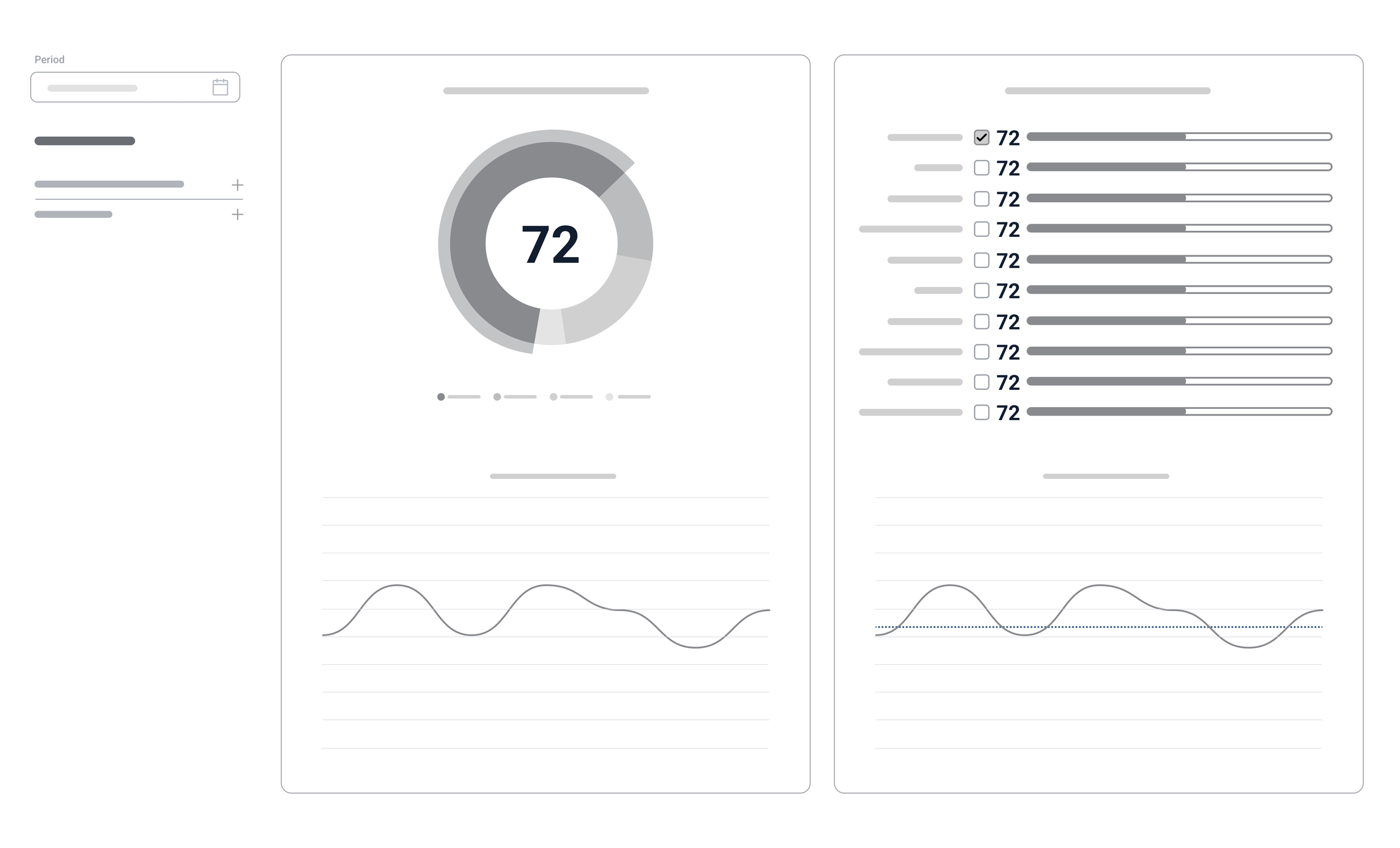
3/3 Dashboard Mockups
The concept for the dashboard mockup was the most challenging for several reasons.
First, because I had to think of a nice way to show the graphs, but without losing the model for reputation and brand tracking which my company had. Moreover, a lot of clients got used to the model and there was a risk that they would not accept the new look.
A second reason was that it was difficult to calculate the number of attributes we might have for the custom section. Therefore, I had to make a few mockups before presenting one for testing.
Below are the final mockups for the dashboard: one with standard attributes and another with custom attributes.
Click the image to enlarge it
3/4 Context Mockups
Click the image to enlarge it
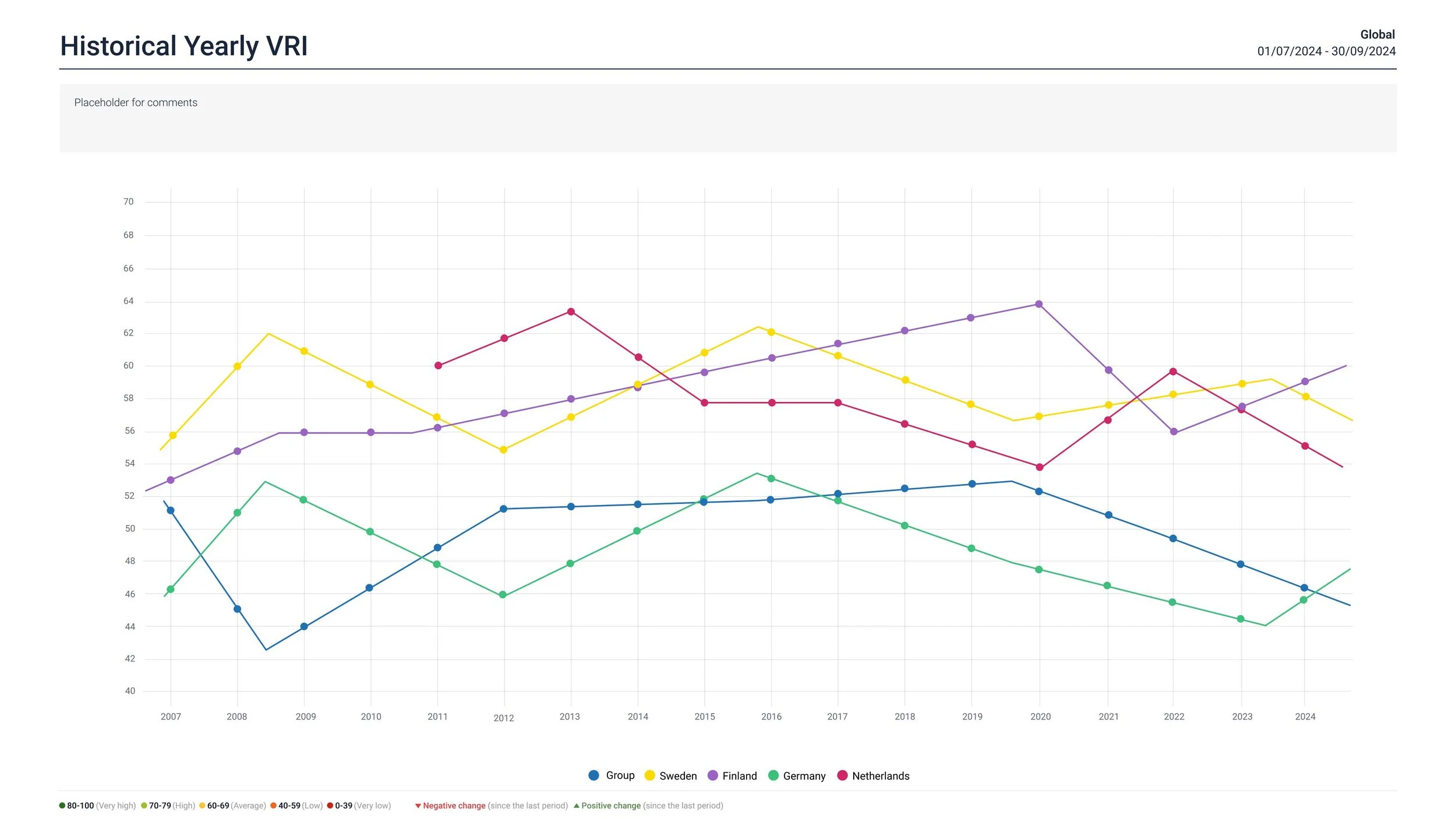
The Context module was a completely new feature we wanted to introduce to our clients. This module was designed to provide a comprehensive overview of how various issues or topics are perceived across three distinct dimensions:
Global level: Focusing on worldwide trends and international viewpoints.
Industry level: Examining perspectives specific to particular sectors or fields.
National level: Exploring interpretations shaped by the unique cultural, economic, and political contexts of individual countries.
Below are the mockups for the three pages: Global, Industry, and Country.
Click the image to enlarge it
Click the image to enlarge it

Click the image to enlarge it

4/1 Filtering System Prototypes
Here is how the old filtering system looked:
4/ Prototyping
Overview
Filtering System Prototypes
Dashboard Prototypes
Design of Context Module
New Login Screen
Automated Reports Design
Click the image to enlarge it
New Filtering System
Click the image to enlarge it
Click the image to enlarge it
Click the images to enlarge them
In addition, I introduced chips with "Show Less" / "Show More" buttons, so users could quickly see the options they selected. For the filters, I also added categories to the chips to organize them better.
Click the image to enlarge it
Click the image to enlarge it
After preliminary testing with some stakeholders and receiving feedback, I decided to add extra customization to the chips by introducing editable chips. These allow users to activate or deactivate a chip without the need to scroll through the selection list and manually select or deselect filter options. By activating a chip, the selection is automatically applied. I also added a "Select All" button for faster interaction with the chips.
Click the image to enlarge it
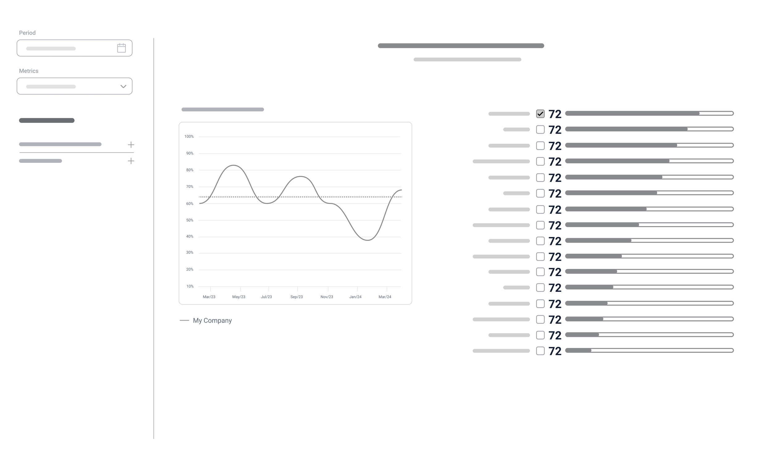
The new look of the dashboard: I created two mockups for the dashboard. The first one featured only the standard model (without any custom attributes), while the second mockup showed the version with custom attributes for customers.
Click the image to enlarge it
Click the image to enlarge it
4/4 New Login Screen
This is a new Login screen:
4/5 Automated Reports Design
Click the image to enlarge it
This was a completely new module, so these are the final prototypes that were sent for development.
This is the old Login screen :
Click the image to enlarge it
Click the image to enlarge it
Click the image to enlarge it
Click the images to enlarge them
Click the images to enlarge them
4/2 Dashboard Prototypes
Here is how the old dashboard looked:
Click the image to enlarge it
4/3 Design of Context Module

5/ Usability Testing
After the high-fidelity prototypes were finalized, I needed to test them with real users. So, I created four usability tests, namely:
Test the new filtering system
Test the navigation
Test the dashboard
Test the new context module
The test goals were:
Assess whether the user encounters difficulties with the app’s navigation.
Identify if the new filtering system covers all user scenarios and is intuitive.
Understand whether the new dashboard is easier to use and determine if there are any flaws.
Target Audience:
I selected five participants: three regular users of our old tracking app and two potential clients who were unfamiliar with our application. All of them were provided with interactive Figma prototypes of the filtering system, navigation, and dashboard.
Tasks:
I created several tasks, including logging in/forgot password, navigating different parts of the app, testing filtering system scenarios, using filters and shortcuts in the dashboard, and exploring the context module.
In general, users were very happy with the design prototypes. Here’s some feedback:
“I was amazed by the clean and well-organized dashboard. It allowed me to quickly grasp key data points.”
“I found the navigation between different modules straightforward, making it easy to drill down into the appropriate sections and subsections.”
“I think the filters are designed intuitively, making it easy for both novice and advanced users to apply and adjust them without a steep learning curve.”
A usability testing report was created, prioritizing the most critical issues. Here is an excerpt from the report.
Take-aways
Through iterative prototyping and usability testing with both internal users and potential clients, I was able to create a more intuitive and efficient user experience. By prioritizing critical issues and gathering real-world feedback, I successfully improved the design of key features like the filtering system, navigation, and dashboard, ensuring they meet the needs of both novice and advanced users.