REDESIGNING REAL-TIME TRACKER
Background
Real-Time Tracker was one of the world’s most powerful online tool for continuously tracking brand health and monitoring perceptions of corporate reputation.
Overview
Problem
The old Real-Time tracker was not user-friendly and difficult to use. You had to scroll through numerous attributes and a user had a difficult time to navigate and use it in a convenient and fast way. Because of the big amount of data, I had to rethink the whole process of working with the app: navigation, menus, filtering system, dashboard, etc.
Project Goals
Design a modern and user-friendly Real-Time Tracker application.
The Process
Mockups
Prototyping
Testing

Research

Analysis

1/ Research
Overview
Competitive Analysis
Customer Interviews
Field Studies
To gain a better understanding of the analytics and real-time platform market, I decided to implement three research methods: competitive analysis, customer interviews, and field study.
For the competitive analysis, I examined some of our biggest competitors and conducted research on current trends in the analytics industry. I also studied several analytical tools to identify the strengths and weaknesses of each and to assess what our platform lacks.
For the customer interviews, I first interviewed some of our stakeholders to understand their vision of the platform and its purpose. Since our stakeholders have extensive experience in the reputation field, I aimed to gather as much insight from them as possible. Additionally, I arranged interviews with a few of our clients. This allowed me to collect perspectives from both customers and stakeholders, revealing some key differences in their views.
For the field study, I visited several of our current customers (primarily analysts) and discussed their experience using our product—what they like, what they need, and what they feel is lacking. I also explored their current challenges and pain points. This proved to be a valuable experience.
I decided to conduct a competitive analysis for several reasons:
To identify the strengths and weaknesses of potential competitors in the reputation and brand tracking industry, which is highly specialized and requires deep expertise.
To enhance my company’s product, service, and overall user experience.
To gain insight into the preferences and expectations of our target customers.
1/1 Competitive Analysis
Click the image to enlarge it
The competitive analysis helped me create a list of features and improvements that my company can implement to gain a competitive advantage, namely:
We need to improve the visual appearance of our product to make it more modern, user-friendly, and intuitive, with a particular focus on the dashboard and overview.
The filtering system and navigation should be redesigned to be more advanced and efficient.
The design of the reports should be reconsidered, and automation should be implemented as much as possible. This will encourage customers to use the platform more frequently while reducing the time spent creating reports and presentations manually.
A greater variety of graphs should be designed, displaying more data to accommodate various customer needs.
I believe this stage is the most important and interesting because it provides valuable insights from real users. To begin, I interviewed several colleagues from the Analytics and Customer Success departments, who are the primary stakeholders since they use the product most frequently. After that, I conducted interviews with customers who agreed to participate.
Here are some of the questions I included in the interviews:
How long have you been using our platform?
What is your role within your organization?
Can you describe a typical session when using our platform?
Which platform features do you use the most, and why?
Do you encounter any specific pain points or challenges while using the platform?
Is there anything you find particularly helpful or efficient about the platform?
If you could improve one thing about the platform, what would it be?
How would you rate the user-friendliness of the platform interface? (Scale)
Would you be interested in using or accessing the platform on a mobile device? (Yes/No)
Are there any features or functionalities you believe are missing from the current platform?
1/2 Customer Interviews
I was very curious to see, in real-time, how people actually use our product on a daily basis. Therefore, I arranged a field study with three of our customers.
For this study, I chose Contextual Inquiry as the most appropriate method. This approach allowed me to both observe users performing their tasks and interview them simultaneously. Two of the participants were analysts, making their input particularly valuable. I asked them to demonstrate their typical workflow when using our platform and observed how they interacted with key features. While watching, I also asked questions about usability, focusing on any frustrations or obstacles that hindered their ability to work efficiently. We agreed that I would record their responses so I could revisit them later and ensure I didn’t miss any important insights.
The third customer was a marketer from a large food and beverage company. Conducting a field study with her was especially interesting because, unlike the analysts, she required a more intuitive and user-friendly experience. First, I asked about her role and daily tasks, then I explored how and why she used our product. She demonstrated a few workflows and highlighted areas where she faced challenges or would like to see improvements.
At this point, I had gathered enough material to move on to the Analysis stage.
1/3 Field Study

2/ Analysis
Overview
Empathy Map
User Personas
User Stories
User Flow
I conducted interviews with users to better understand their experience with the filtering system and the application as a whole. Based on their feedback, I outlined the key characteristics that the filtering system should have:
- Simple and intuitive
- Flexible
- Easy to use and customize
- Visible and easily accessible
2/1 Empathy Map
I decided to create an Empathy Map for two reasons. First, to gain a clearer understanding of our real users based on the data gathered from studies and interviews. Second, to compile their pain points, thoughts, and needs in order to design a truly effective solution.
Click the image to enlarge it
I created two types of user personas:
Liane – An analyst who requires an advanced analytical tool to work with complex data. She needs an intuitive real-time tracker that allows her to easily manipulate large datasets.
Janette – A marketer who doesn’t need an advanced tool. Instead, she requires a simple platform that provides accurate data for various marketing campaigns, reports, and posts.
2/2 User Personas
Click the image to enlarge it
Click the image to enlarge it
2/3 User Stories
After completing the user personas, I began creating user stories. I believe user stories are a great way to clearly define objectives and will help in creating more accurate user flows later. Below are the user stories for the filtering system:
As a user, I need to see which filters I have selected in different categories (chips) so that I don’t have to scroll through the filters’ list to check which ones are selected.
As a user, I want to quickly find a company and country in the filters to avoid going through all the options (especially when there are hundreds of companies or countries).
As a user, I want to limit the list of companies based on the selected country so that I can choose from a smaller, more relevant list.
As a user, I need an option to reset all selected filters so that I don’t have to unselect each filter manually.
As a user, I want to be able to select all filters with one option (i.e., Select All).
As a user, I need filter categories to expand or collapse so that I can select only the filters I need.
As a user, I need a "Show More" and "Show Less" option if there are many chips.
As a user, I want the ability to activate or deactivate chips (without closing them) so that I don’t have to go back to the filters’ list each time I need to unselect a filter.
As a user, I want to be able to select or unselect all chips so that I don’t have to select or unselect them one by one.
2/4 User Flow
For the user flows, I decided to create a flow for the filtering system, as it required a thorough analysis before designing the wireframes. For navigation and other features, I felt that designing wireframes alone would be sufficient, and user flows were not necessary. Below is my user flow for the filtering system.
Click the image to enlarge it

3/ Mockups
Overview
Filtering Mockups
Navigation Mockups
Dashboard Mockups
Context Mockups
It was now time to create low-fidelity mockups and get approval from stakeholders.
3/1 Filtering Mockups
The first thing I did was divide the "Company" and "Filters" into two separate tabs for convenience. In the first step, the user selects the company or companies, then moves on to the filter selection.
For company selection, I also introduced a search function so that users could find a company instantly. Additionally, I replaced the black highlights with checkboxes. I also added categories and subcategories to the filters, which were then reflected in the chips.
Click the image to enlarge it
3/2 Navigation Mockups
For the navigation pane, I introduced two views: expanded (default) and collapsed. The expanded view is useful for new users who are still learning the platform and its modules. The collapsed view is preferable for users who are working with large amounts of data and need more space on the main screen for graphs or dashboards.
Click the image to enlarge it
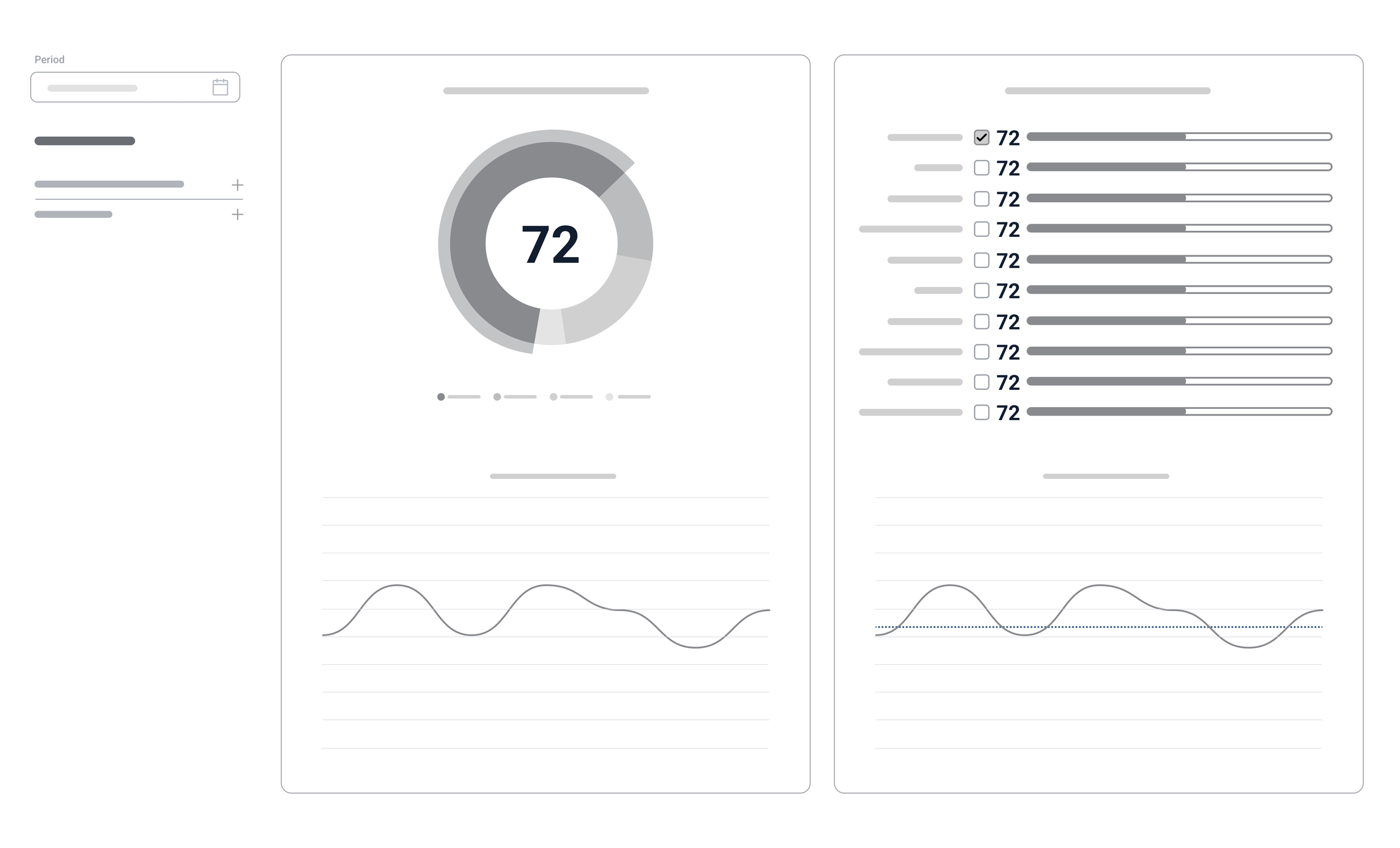
3/3 Dashboard Mockups
The concept for the dashboard mockup was the most challenging for several reasons.
First, because I had to think of a nice way to show the graphs, but without losing the model for reputation and brand tracking which my company had. Moreover, a lot of clients got used to the model and there was a risk that they would not accept the new look.
A second reason was that it was difficult to calculate the number of attributes we might have for the custom section. Therefore, I had to make a few mockups before presenting one for testing.
Below are the final mockups for the dashboard: one with standard attributes and another with custom attributes.
Click the images to enlarge them.
3/4 Context Mockups
The Context module was a completely new feature we wanted to introduce to our clients. This module was designed to provide a comprehensive overview of how various issues or topics are perceived across three distinct dimensions:
Global level: Focusing on worldwide trends and international viewpoints.
Industry level: Examining perspectives specific to particular sectors or fields.
National level: Exploring interpretations shaped by the unique cultural, economic, and political contexts of individual countries.
Below are the mockups for the three pages: Global, Industry, and Country.

Click the images to enlarge them

4/ Prototyping
Overview
Filtering System Prototypes
Dashboard Prototypes
Design of Context Module
New Login Screen
Automated Reports Design
Knowledge Center Design
4/1 Filtering System Prototypes
Here is how the old filtering system looked:
Click the images to enlarge them
New Filtering System
In addition, I introduced chips with "Show Less" / "Show More" buttons, so users could quickly see the options they selected. For the filters, I also added categories to the chips to organize them better.
Click the images to enlarge them
Click the images to enlarge them
After preliminary testing with some stakeholders and receiving feedback, I decided to add extra customization to the chips by introducing editable chips. These allow users to activate or deactivate a chip without the need to scroll through the selection list and manually select or deselect filter options. By activating a chip, the selection is automatically applied. I also added a "Select All" button for faster interaction with the chips.
Click the images to enlarge them
Click the images to enlarge them
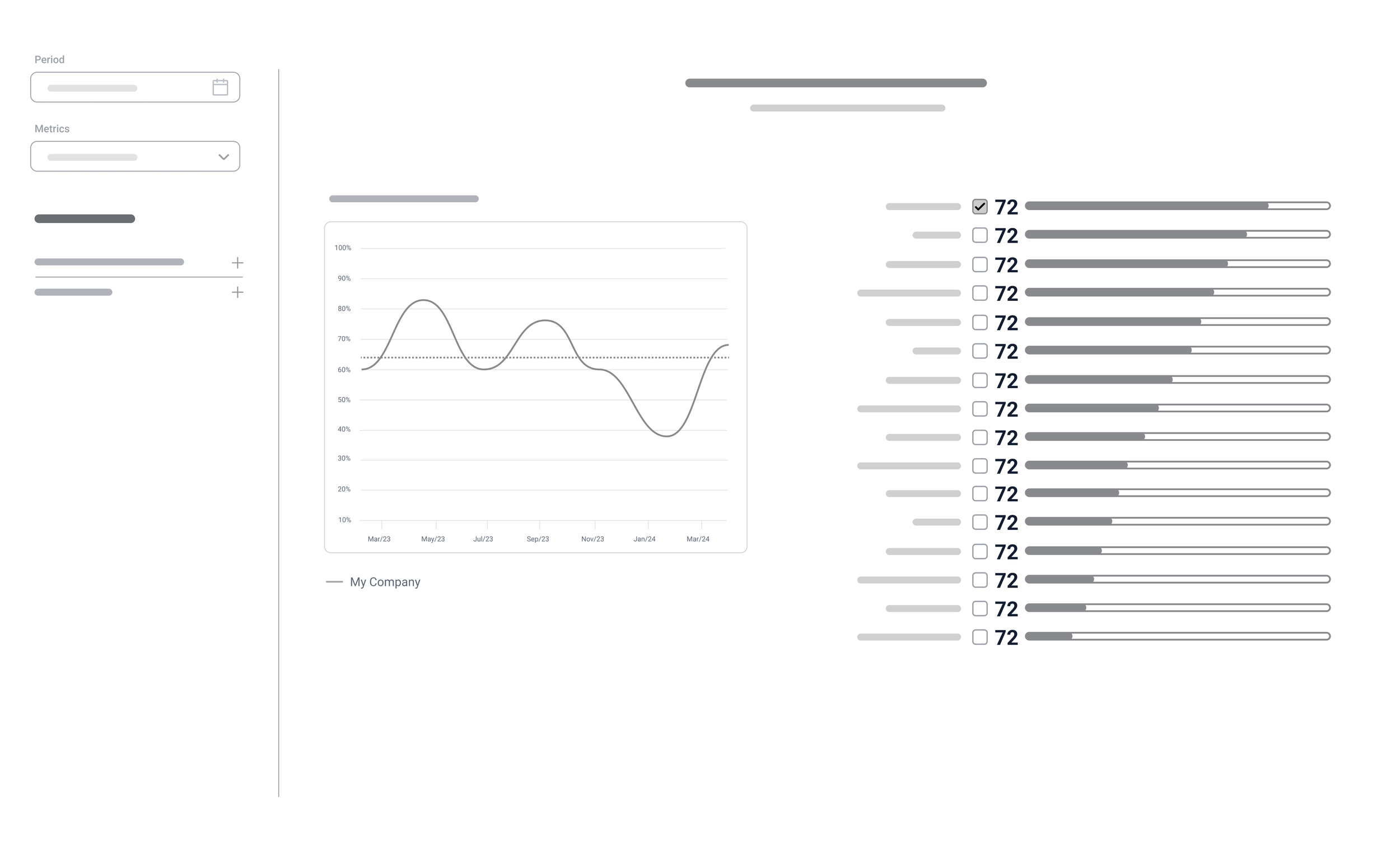
4/2 Dashboard Prototypes
Here is how the old dashboard looked:
Click the image to enlarge it
The new look of the dashboard: I created two mockups for the dashboard. The first one featured only the standard model (without any custom attributes), while the second mockup showed the version with custom attributes for customers.
Click the images to enlarge them
Click the images to enlarge them
4/3 Design of Context Module
This was a completely new module, so these are the final prototypes that were sent for development.
Click the images to enlarge them
4/4 New Login Screen
This is the old Login screen :
This is a new Login screen:
Click the image to enlarge it
4/5 Automated Reports Design
4/6 Knowledge Center Design
After completing the design of the main modules, I identified the need to create a Knowledge Base to organize and present the extensive material produced by the company over the years. I structured the content into categories, designed a search function, and introduced both list and icon views, along with several other key features to ensure easy navigation and accessibility.
Click the images to enlarge them

5/ Usability Testing
After the high-fidelity prototypes were finalized, I needed to test them with real users. So, I created four usability tests, namely:
Test the new filtering system
Test the navigation
Test the dashboard
Test the new context module
The test goals were:
Assess whether the user encounters difficulties with the app’s navigation.
Identify if the new filtering system covers all user scenarios and is intuitive.
Understand whether the new dashboard is easier to use and determine if there are any flaws.
Target Audience:
I selected five participants: three regular users of our old tracking app and two potential clients who were unfamiliar with our application. All of them were provided with interactive Figma prototypes of the filtering system, navigation, and dashboard.
Tasks:
I created several tasks, including logging in/forgot password, navigating different parts of the app, testing filtering system scenarios, using filters and shortcuts in the dashboard, and exploring the context module.
In general, users were very happy with the design prototypes. Here’s some feedback:
“I was amazed by the clean and well-organized dashboard. It allowed me to quickly grasp key data points.”
“I found the navigation between different modules straightforward, making it easy to drill down into the appropriate sections and subsections.”
“I think the filters are designed intuitively, making it easy for both novice and advanced users to apply and adjust them without a steep learning curve.”
A usability testing report was created, prioritizing the most critical issues. Here is an excerpt from the report.
Take-aways
Through iterative prototyping and usability testing with both internal users and potential clients, I was able to create a more intuitive and efficient user experience. By prioritizing critical issues and gathering real-world feedback, I successfully improved the design of key features like the filtering system, navigation, and dashboard, ensuring they meet the needs of both novice and advanced users.